Three months, 104 treasures, one extraordinary book
How Sam Gray designed the book of 26 Treasures
How’s this for a brief? Create a book that features 104 treasures from four museums across the UK and the work of around 100 writers. Use photography from various sources. Show artists’ interpretations of the treasures on a quarter of the pages. Have another quarter in both Welsh and English. Present the work so it makes a coherent whole. Work with a brand new crowd-sourcing publisher. Make it beautiful. Do it in three months.

Mr No-Body, a 17th century drinking glass from the V&A who inspired Andy Hayes to write a sestude for 26 Treasures
Sam Gray, a graphic designer based in Plymouth, took up the challenge to design the book of 26 Treasures. He produced an elegant volume that showcases personal, emotional responses to treasures from the V&A, the National Library of Wales, the Ulster Museum and the National Museum of Scotland. Andrew Motion, Gillian Clarke, Paul Muldoon, Michael Longley and Alexander McCall Smith are among the writers who encapsulated their thoughts about these treasures in exactly 62 words.
Here’s how Sam designed a book that’s become a treasure in itself.
How did you get involved with 26 Treasures?
“I can make a pleasant nuisance of myself if I want in on something. I first met John Simmons when I went back to Plymouth College of Art and studied the relevance of storytelling in contemporary branding. He kindly agreed to an interview, and as we talked, he told me about the writers’ collective 26, so I joined and really liked the people. I’ve worked with a number of different groups before, but I don’t think I’d ever met a group of people so set on making such a difference to the world we live in, with words, until I met 26. They really are an inspiration.
“I worked with Rob Self-Pierson on the Playing Places project and came up with the idea and web site for 26 Stories of Christmas. John asked me to design the display boards for the Welsh treasures at the Eisteddfod and I said at the time: ‘If you ever turn 26 Treasures into a book, I’d like to design it.’ So when Unbound said they’d like to publish the book, I was there, knocking at John’s door.”

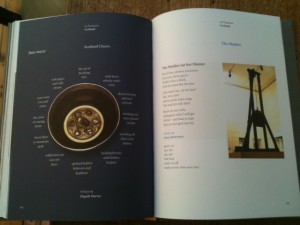
Elspeth Murray writes about the Bute Mazer (L) and James Robertson looks at The Maiden (R), a 16th century guillotine
Why did you take on the project?
“I thought 26 Treasures was an excellent idea, and loved the way it made art more accessible. I also like that all 26 projects bring such large groups of people together. It’s amazing how much time people put into these projects – it must be thousands of hours altogether for something like 26 Treasures. The results are always amazing – and each project seems to be better than the last.”
How did you approach the design task?
“I plan rigorously, and for me form follows function. The content was the most important thing, so I based the design on the Welsh section because it was the most complicated – having both English and Welsh text with imagery. Then I looked at the Irish section, which included text from writers and visual responses from artists. Scotland was next, followed closely by London, and as the book developed each section changed pace, but the initial template remained strong and simple.”
What’s that typeface?
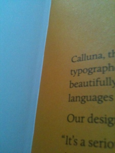
“We used a new typeface called Calluna. It was designed in 2009, but looks as though it’s been around for years. It really is beautiful and, to be honest, that’s the reason I chose it. I love working to restrictions, so this was a great chance to get lost in typography and make sure it worked in the layout and had a flow from page to page.”
How did you come up with the cover?
“It was daunting designing the cover. I’ve got a lot of respect for designers like Harry Pearce, Dom Lippa, and Pentagram’s work. They’ve got long-standing links with 26, so the cover needed to be good, but with that background, I wanted to try and make it super good.
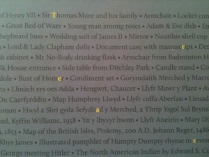
“I wanted the cover to tell a story. It was important to reflect the enormity of the project – 104 treasures from four different museums – and the way that all these treasures were dug out from the archives. So it seemed like a nice idea to name all the 104 objects and pick out the word ‘treasures’ from within those words. At the beginning it seemed too subtle an approach, but as we progressed, it felt right.”
What did you learn from Unbound?
“It was great working with John, Xavier and Rachel from Unbound – their knowledge of publishing is endless. I think if anything, they taught me to be a little more relaxed about large projects. The process certainly confirmed that good things come from working with the best groups of people. It’s very rarely a one man show.”
Any advice to pass on?
“This is the first book of this size I’ve designed, and I’d say there are three key things to think about before starting a project like this. The first is to develop a concise but flexible page plan. The second is to study the content thoroughly, and the third is to give yourself plenty of time to put it all together. We were able to spend a good amount of time on the pages, making sure that they did all they could and that the work was presented in the best possible light.”
Which treasure would you have chosen?
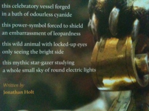
“The Leopard flagon from the V&A section, without a doubt. The picture Jessie Simmons took is great, and the words written by Jonathan Holt are brilliant. I particularly like ‘leopardness’.”
Contact Sam
Email sam@madebyfabric.com
Visit www.madebyfabric.com
Tweet @madebyfabric


