Designer soapbox: Tim Foster
Born in Yorkshire and raised in Kent, Tim Foster trained at Ravensbourne and since then has worked for everyone from the Observer magazine to Dorling Kindersley and Mitchell Beazley (twice). Here he talks about combining his roles as an editorial designer and art director, why he loves working with text, and what inspires him.
What’s your favourite tip for getting inspiration?
Designers who work on their own need to get out of the studio. Stepping away from the computer is a good thing. You can search and find anything you like online, but I don’t think it’s inspiring to huddle over your computer wearing ear phones.
I live in East London, so if I need inspiration, I usually go to a gallery – Tate Modern, the Whitechapel or the National Gallery.
I keep my eyes open and normally get inspired by something I see on the journey. It could be a poster on the tube, the cover of a book someone’s reading or a shop window. It’s about picking up one thing that triggers off a thought so you have a new idea. The process – going out, putting myself in front of material and coming back – shifts my thinking.
I also love visiting the London Review Bookshop and Waterstones in Piccadilly, where I head for fiction to look at covers and also cookery books. The majority of best selling, illustrated non-fiction books are cookery and that means there is a decent budget for designers to be creative with layout, photography and print finishing.
What first made you want to become a designer?
I liked drawing and art and at 16 decided to go to art school. I never really thought of any alternative. In the ‘60s and ‘70s art schools were places where musicians and designers could be creative and experimental and I was attracted to the idea of a non-conformist environment. I went to Ravensbourne, which was very typographically orientated, so the course pushed me towards a greater understanding of graphic design.
How did your career start?
My first job was working for a direct mail advertising agency, where I learned about coping under serious pressure. Next I went to work for Frances Lincoln, a publisher of illustrated reference books. The market in the 70s had really opened up for lavish educational books with a high illustrative content. After that, I worked for National Magazines on the Observer colour magazine and subsequently as an art director for a variety of publishers.
Which do you prefer – designing or art directing?
I like doing both, and wouldn’t want to do either exclusively. Having spent many years as an art director managing a large number of projects it’s great to get back to designing pages because I still enjoy the craft of it. I like working out the puzzle of how to get the different page elements to fall together naturally. But I also enjoy art directing, which is about guiding illustrators and photographers to produce work that is aesthetically right and fits the editorial content.
What are the different challenges when you’re working on books compared to brochures or reports?
Well, a book can be 440 pages long and involve 1,000 images, so planning and control are vital. The decisions you make in the first few weeks are really important because a book that’s off schedule can’t be fixed by a couple of people working all night. It’s like turning a tanker around.
Also, working with a publisher has more of an in-house quality. There’s usually an in-house team and you’re working closely with an author. Whereas with a company report, the external client might be less familiar with the design process.
What work do you most enjoy?
I’ve always naturally gravitated towards design that’s generated from text. When I was at Frances Lincoln I worked on a book called Rings of Stone about stone circles, and discovered that I really enjoyed getting the pictures to work with the text. I also enjoy designing covers and the challenge of reconciling the needs of marketing with an attractive visual solution. But I’ve never done decoration for its own sake. I start with the text and enjoy getting familiar with it and working with the author to define the best artwork or photography to define that content.
What do you enjoy about working with writers?
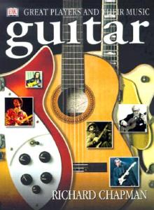
If an author has command of their subject, it’s a joy to work with them. I did a big book on the guitar with Richard Chapman for Dorling Kindersley. It was great because we were able to work together incredibly closely for nearly two years to flesh out the subject in detail. He had a massive knowledge of the subject and I was able to channel that into a manageable form for a book. It helped that I play the guitar too. It was very exciting to be part of that kind of collaborative process – a virtuous circle of skills. It’s very different from just being given a Word document of text when you’ve never met the writer.
What drives you mad about writers?
I was once in a meeting with a very senior publishing executive when he said that authors are the most unreliable suppliers on the planet. That seems a bit harsh but the late arrival of text ripples through the whole process and limits the time available for designing, so it’s a challenge to maintain quality. I’ve worked with authors who are years late. That’s the stuff that drives designers mad.
Three minute insight
- Who’s your design hero/heroine? I don’t really have one. I’ve always seen design as commercial art. The creative people I admire are usually musicians and painters. Hockney for endeavour, Velasquez for skill, Keith Jarrett for exploration and Keith Richards for surviving…
- What’s the last exhibition you saw? Leon Kossoff at the Annely Juda gallery. He does these wonderful drawings of London: big, bold and scribbly. There are lots of the East End, Ridley Road market and Battersea Power Station. I just love them – they have a real energy.
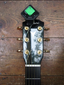
- What’s your favourite gadget? It’s a little tuner that you clip onto the headstock of your guitar. When you hit the string, it senses whether the note is sharp or flat.


